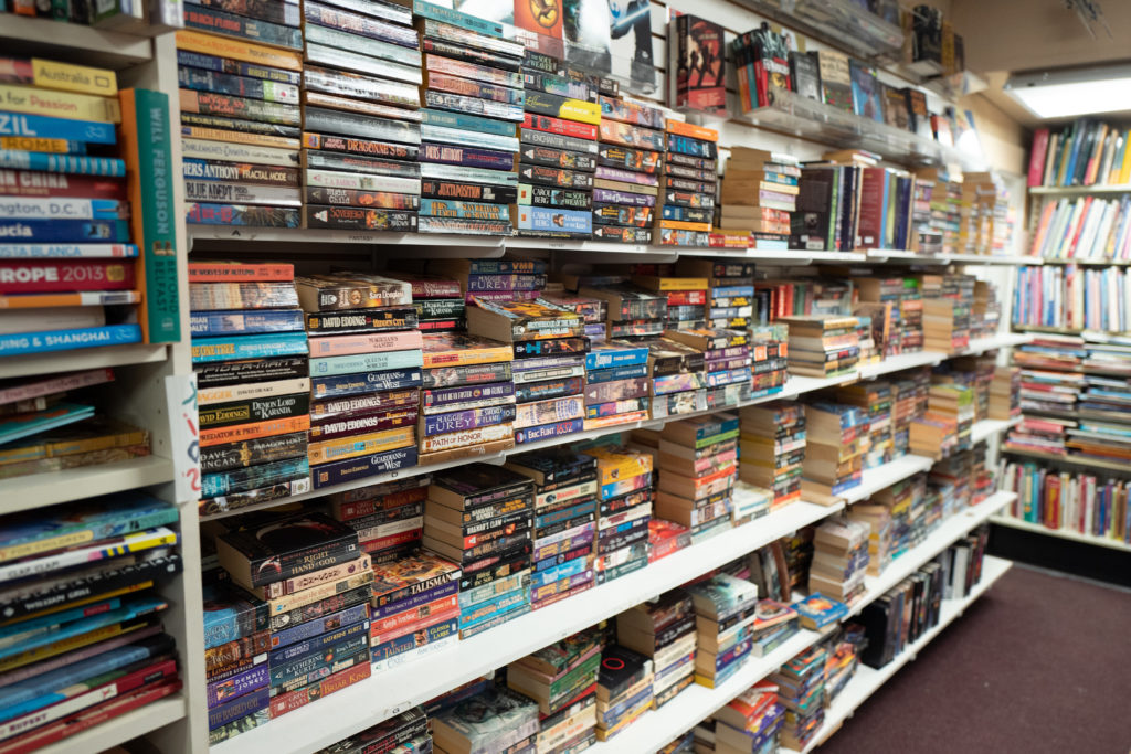
Take a look at the photo above. What do you see?
I see a wall of sameness.
But that sameness has a purpose! It tells you these books belong to a genre. In this case, the genre is fantasy fiction.
And that’s a good thing! If you want people to quickly identify your book as fantasy fiction, you design it to look like other books in that genre.
However, looking like everyone else in your genre is a double-edged sword.
It is true that if we look like everyone else, people will recognize us when they see us. And that’s a good thing.
The problem is, looking like your peers makes it super hard to stand out. When you look at these books, you really have to squint your eyes to distinguish one book from the next.
It feels safe to look like everyone else in your genre. But it comes with a trade-off: differentiation.
So how do you safely show you belong to a genre while also standing out? That’s the line you need to tow carefully.
If you stand out too much, people mistake you for something else entirely. But if you blend in too much, people don’t think to buy from you without a lot of thought.
At the end of the day, people decide based on the differences, not the similarities between things.
How you tow that line is up to you.
—kw
P.S. If you look closely you’ll notice one book is different. It’s on the bottom row in the middle. It has a red circle on it. It’s a Lord of the Rings book—one of the best-selling books in its genre. Coincidence?
P.P.S. This Wednesday at 11 am EST, I’m hosting a live workshop: How to Package, Price, and Sell Custom Consulting Engagements. It will be 90 minutes including Q&A, with a full recording made available to those who register. Get into this if you plan on doing any custom work this year—it will be worth it. Full details and to register: https://kevin.me/ccs/